Outdoor Chef

A UI/UX Case Study for a responsive web cooking app.

THE PROJECT:

Let’s face it, planning meals while on the road can be exhausting and time-consuming.

Introducing Outdoor Chef, a responsive web app that simplifies finding, sharing, and storing delicious off-the-grid recipes written exclusively for outdoor cooking. Outdoor Chef invites users to engage in a community of like-minded adventure seekers looking to enhance their “off-the-grid” cooking and practical skills.

MY ROLE

UI/UX Design
Prototyping
User Research
Moodboard
User Stories
User Flows
Style Guides
Iconography

The Process

Problem
I’ll admit the thought of designing a recipe app that was uniquely superior to the hundreds of apps out there seemed nearly impossible. It was crucial to obtain accurate information from the beginning.

Solution
It was vital to investigate some of the key competitors on the market whose functionality mirrored my goals and objectives: The Liquor Cabinet, All Recipes, Kitchen Stories, and Oh She Glows. From there I began a more detailed study of the art of cooking while outside using a clearly defined methodology that involved several stages of research, testing, conceptualization, iteration, and finally presentation. Core to my research was understanding, and observing the user. This process gave me a thorough understanding of the user, the problems they faced and the best possible solution.

About Outdoor Chef

As part of the UI curriculum at CareerFoundry, I was asked to research and design a responsive recipe app that met the current needs of users while solving the problems they faced with existing recipe apps.  
 
I have a personal interest in cooking outdoors while at home, hiking, camping, road-tripping, RV’ing, etc. Curiosity led me to investigate the current online resources available to meet these specific needs. My exploration showed a lack of a single source where a person could access recipes specifically written for cooking outdoors. User interviews supported this conclusion.  It was clear that there was a demand for a responsive recipe app that simplified finding and sharing recipes written exclusively for outdoor cooking.
 
Outdoor Chef was born from the shared frustration of the inability to find a centralized source for recipes suited for cooking while enjoying the outdoors. Enjoy this exploration!

User Personas

Sam: Cooking around a campfire, it's about creating Memories.

GOALS/NEEDS:

  1. being inventive” cooking over a campfire
  2. learn how to “incorporate wild food” into meals while traveling
  3. minimizing waste” find more recipes using “wild game”
  4. ability to “convert recipes” based on number of diners


MOTIVATIONS:

  1. “diversify” traveling menus
  2.   cooking with husband, friends, and family
  3.   travel ready” recipes
  4.   connecting with a others” who cook with wild game


PAIN POINTS:

  1.   Lack of single recipe index system:
  2. currently using “boundless sites to store favorite recipes”
  3.   too many ads when trying to cook

Paul: The solitude of backcountry camping nourishes my soul."

GOALS/NEEDS:

  1. being inventive” cooking over a campfire
  2. learn how to “incorporate wild food” into meals while traveling
  3. minimizing waste” find more recipes using “wild game”
  4. ability to “convert recipes” based on number of diners


MOTIVATIONS:

  1. “diversify” traveling menus
  2.   cooking with husband, friends, and family
  3.   travel ready” recipes
  4.   connecting with a others” who cook with wild game


PAIN POINTS:

  1.   Lack of single recipe index system:
  2. currently using “boundless sites to store favorite recipes”
  3.   too many ads when trying to cook

Stephanie: Camping is when we can be silly, spontaneous, and free from the distractions of everyday life.”

GOALS/NEEDS:

  1. need to store a “menu for traveling” where the user could ‘switch’ meals within the app, while on the go

  2. be nice to know if recipes are “cheap” or “expensive” to prepare

MOTIVATIONS:

  1. cooking with family” while traveling with camper

  2. planning “trip menu’s on phone,” with the ability to “swap out”meals.

  3. be more “streamlined” and “organized”

  4. budget-friendly” traveling cooking recipes


PAIN POINTS:

  1. “too many” recipe sites with not enough focus

  2. “no filtration method” for recalling saved recipes

  3. lack of way to “store trip menu” on phone

User Stories

Three User Personas were developed after analyzing patterns that emerged during user interviews. Each user persona represents a target audience, their preferences, goals and motivations. Creating these personas ensured that the users best interests were always central to the development of the final product.

While searching for recipes to cook outside, I want to be able to refine my search options to my specific needs so that I can minimize the information I have to look through.

I want to be able to share recipes with my friends and family.

When planning to cook a meal outside, I want to be able to find a recipe that is tailored to a specific activity, so I don’t have to waste valuable time.

When viewing recipes I want to be able to save my recipes, so all of my dishes are in one place.

I like the convenience of logging in using my Gmail account.

User Flows

Using the user stories, this flow diagram illustrates the different journeys the user can take based on key needs.

The Moodboard

The moodboard reveals the “look & feel” for the development of the project. My intent was to evoke a grounded and adventuresome feel, while remaining friendly and natural. My research was guided by these characteristics: Rustic, Earthy, Natural, Real, Resourceful

Wireframes. Tool Filter

Low-Fidelity
Medium Fidelity
High Fidelity

Wireframes. Saved Recipes

Low-Fidelity
Medium Fidelity
High Fidelity

Wireframes. Dashboard

Low-Fidelity
Medium Fidelity
High Fidelity

Wireframes. Sign Up

Low-Fidelity
Medium Fidelity
High Fidelity

User Preference Test

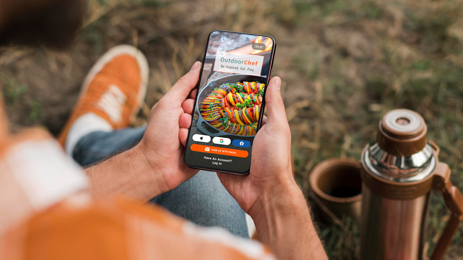
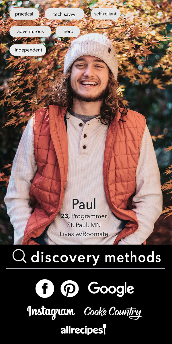
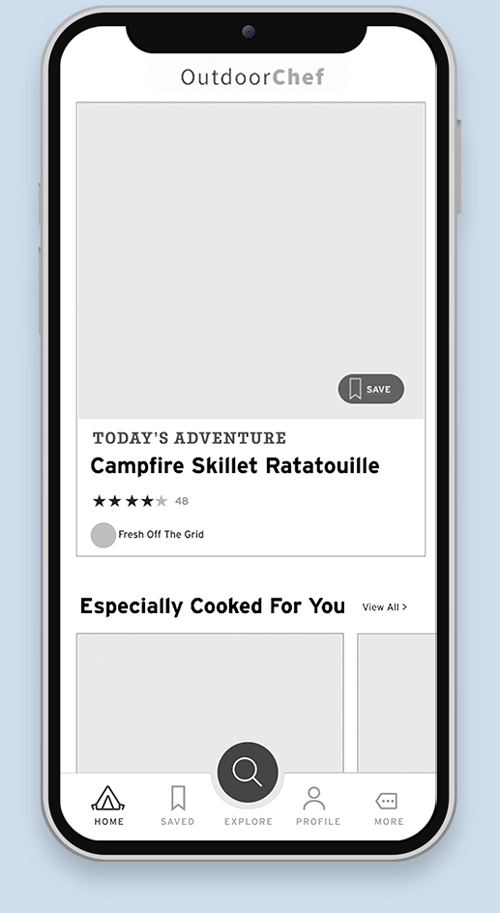
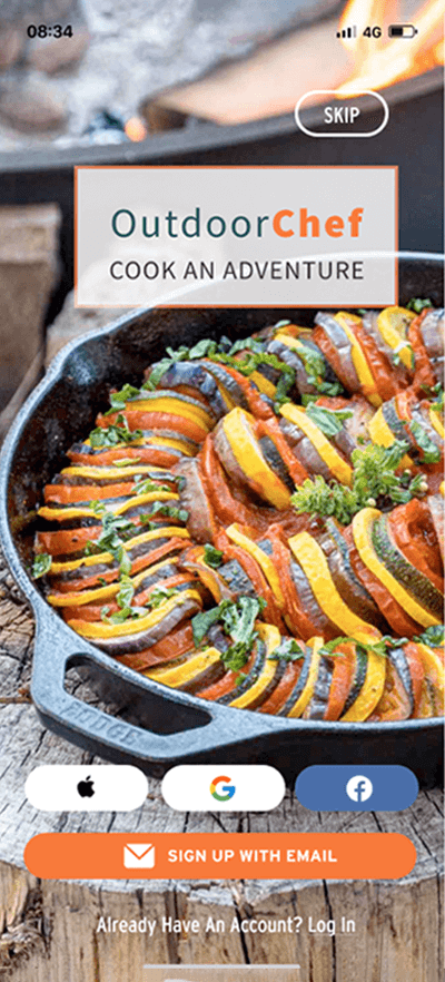
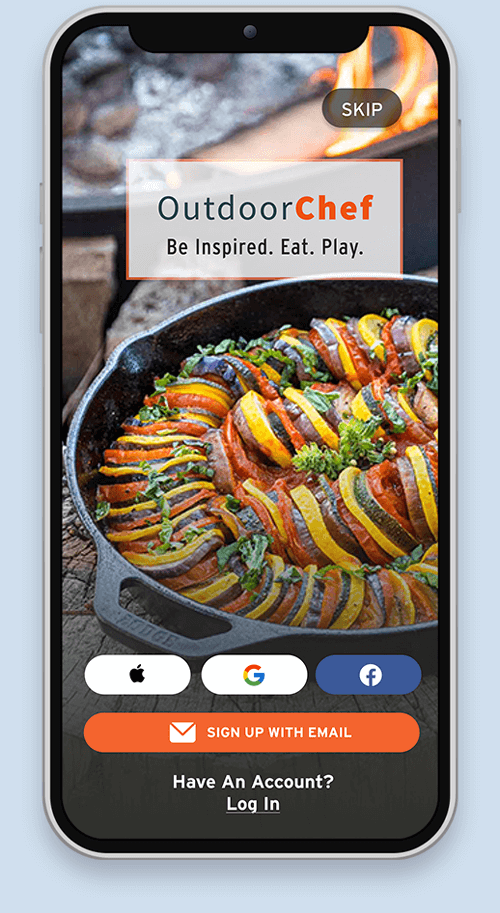
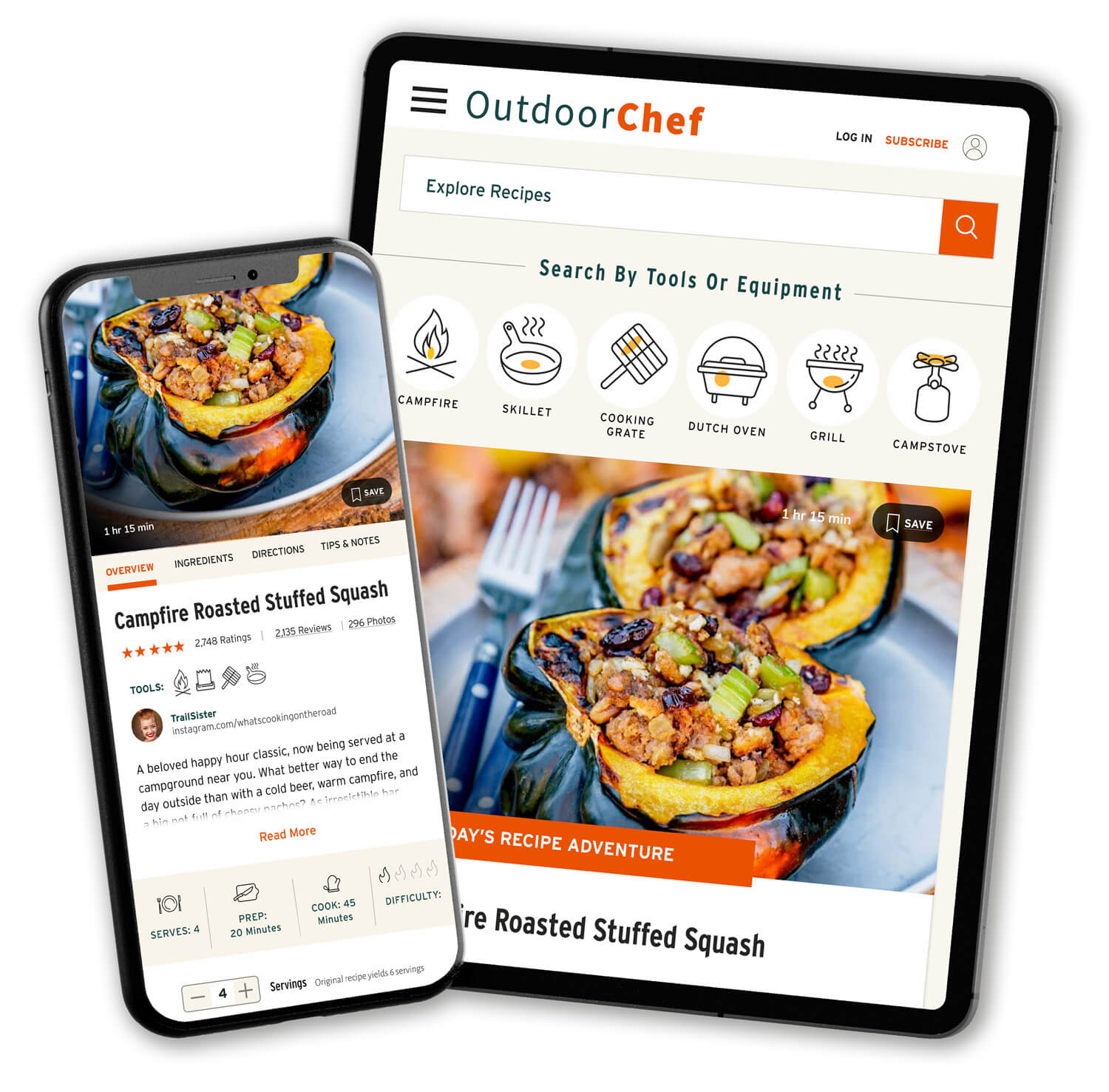
A user preference test revealed that Screen 1 was the preferred choice for the app welcome screen.

Although the clear winner, with a preferred ratio of 80% there were a few items that required attention to improve the function and appeal of the welcome screen. Some of the comments included:

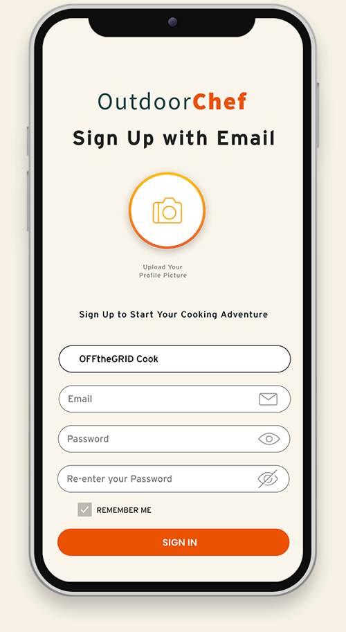
Screen 1: “I like the screen image better, but the buttons and the “login in” option can be overseen easily (maybe more contrast/darker background)”

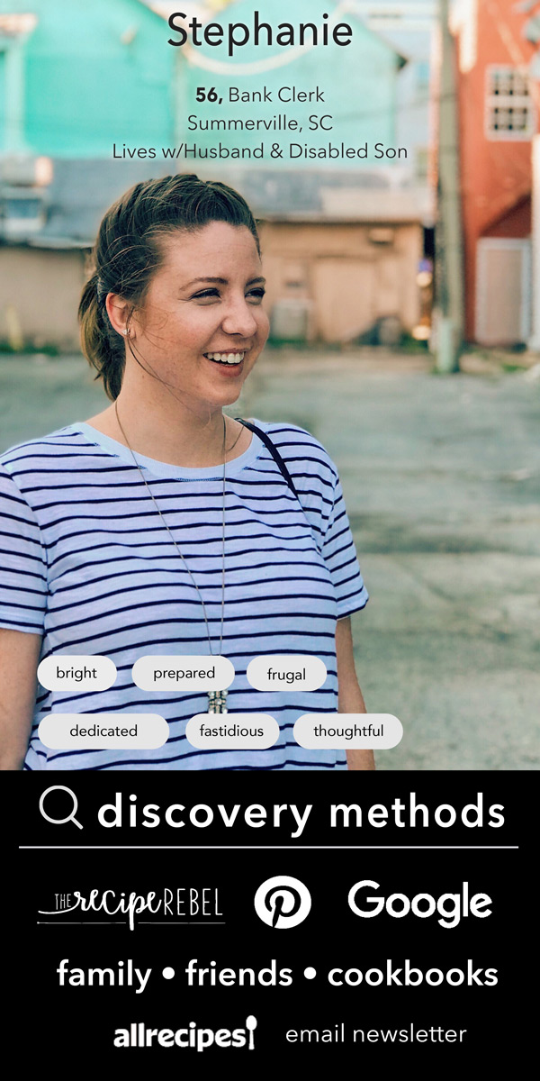
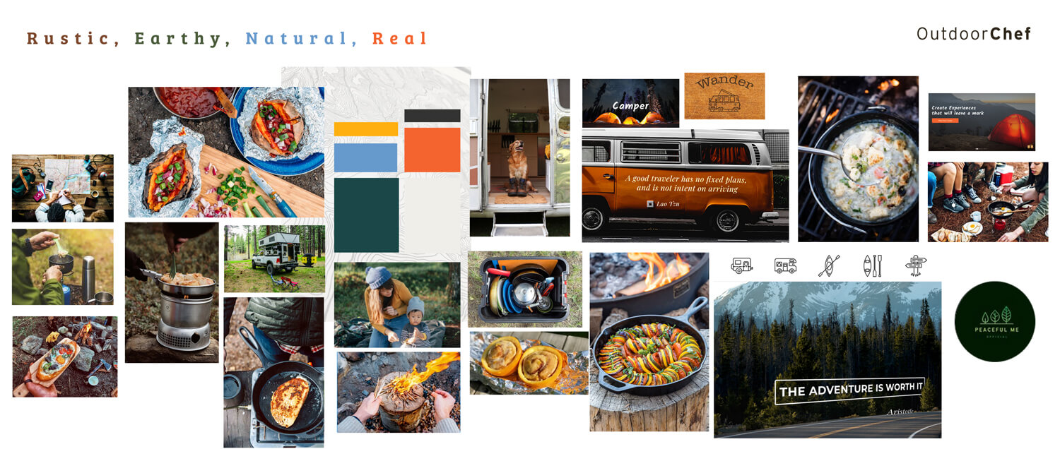
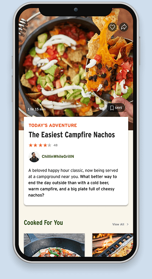
Screen 1:  I think this dish looks like a “chef”. I mean, what a chef would do, it looks made in the outdoors, it looks easy to do but still has some level of preparation and aesthetic. This photo and layout is great in portraying the meaning of OUTDOOR CHEF. 

Screen 1
Screen 2
Final Screen

App Design. Login

Users have the option to login or setup an account using their username/email, Apple, Google, or Facebook accounts. For users hesitant to register for yet another recipe app, there is an option to skip.

App Design. User Profile

User has access to all recipes, trip menus, and saved resources. Viewing options include image or list. Ability to filter recipes further using filter tab.

App Design. Search Filter

A sophisticated search & filter option simplifies finding the perfect outdoor recipe. Select a single filter or multiple to meet needs.

Multiple Filter Options
Filter by: Activity
Filter by: Tools/Equipment

App Design. Dashboard

The user’s dashboard page is personally curated based on their previous app engagement. Besides access to delicious outdoor recipes, OutdoorChef introduces multiple resources designed to connect them to other uses and articles aimed to help simplify their “off the grid” adventures.

App Design. Recipe Pages

Design. Responsive

Style Guide. Color Palette

Style Guide. Typography

Style Guide. Iconography

Design. Web

Be Inspired. Eat. Play.

Thanks for sharing this journey with me....